
The University of Arizona International Rebranding
Role
Design
Illustration
Art Direction
Overview
The University of Arizona International Admissions rebrand establishes a fresh youthful sub-brand dedicated to global student recruitment and onboarding. This cohesive design system transforms traditional recruiting materials into vibrant, narrative-driven experiences that highlight sunny Tucson, the welcoming Wildcat community, and real international student stories.
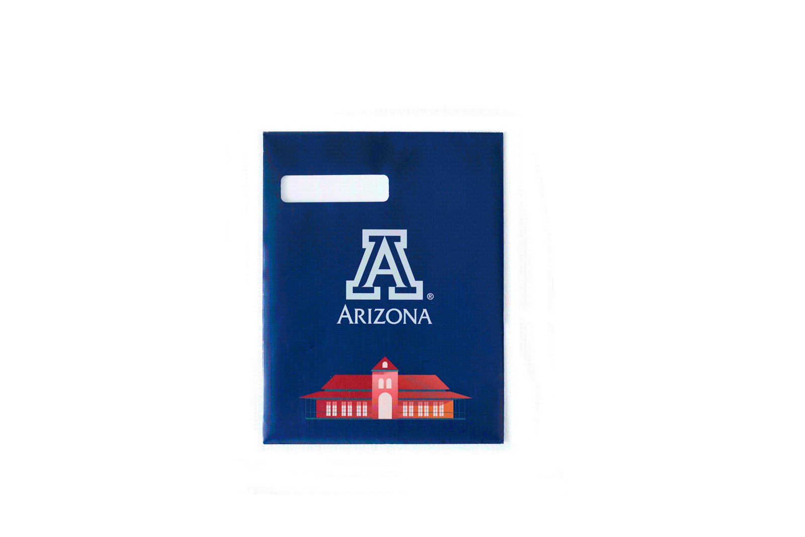
Admission Pack
The first component is the admissions packet that is sent out to the 4000+ international students who are admitted each year. The purpose behind the redesign was to bring some excitement while providing a preview of campus life for incoming students would begin to feel a sense of familiarity and community before coming to campus, as well as giving them the relevant next steps they have to complete before they journey to Tucson.


Process
The rebrand launches with the redesigned admissions packet and extends across a full suite of materials, ensuring tonal consistency from first inquiry to commitment. Key deliverables include:
-
Undergraduate brochure
-
Graduate brochure
-
Admissions packet (mailed to 4,000+ admitted students annually)
-
Commit pack with swag (celebratory package for students who are enrolled)
-
Social media campaign assets
-
Google ad campaign assets
This sub-brand complements the core University of Arizona identity, using Arizona Red and Blue as anchors while introducing fresh secondary colors to evoke optimism and energy.
Past Admit Packet
The previous version of the admission packet was also designed by me a couple of year earlier. The design used traditional primary colors.
It was a bare bones approach in terms of contents. The packet included:
3 stickers, a parent post card, the official admissions letter, a personalised postcard from the admissions team, and a die-cut block-A cutout of school spirit.
Concept Development
A set of various visual assets were created to extend the tone of voice of the brand, maintaining consistency and reinforcing the playful identity of a young mind on a university campus and building a community and a future.
Target Audience
-
Prospective international undergraduate students (high school graduates seeking an adventurous college experience).
-
Prospective international graduate students (career-focused individuals pursuing advanced degrees).
-
Families and supporters (engaged through shared materials).
-
International recruitment teams
and counselors.
Brand Essence
Essence: A sunny, welcoming Wildcat home away from home for ambitious international students.
Promise: Clear, friendly guidance from first inquiry through commitment, with real stories that reduce the stress and risk of studying abroad.
Personality: Youthful, warm, confident, globally minded, and playful but still academically serious.
Capturing Arizona's Sprit in Photos
I was part of directing photoshoots with real international undergraduate and graduate students in authentic settings—campus activities, Tucson explorations, group interactions. Focus on diverse representation, genuine emotions, and sunny lifestyles to build trust and relatability. Over time we were able to create a large in house photo library telling authentic stories and entirely moved away from stock imagery.


Colors
The Primary brand colors are Arizona Red and Arizona Blue.

I wanted to give the brand a fresh look by emphasising on the secondary and complimentary colors of the brand.

A set of various visual assets were created to extend the tone of voice of the brand, maintaining consistency and reinforcing the playful identity of a young mind on a university campus and building a community and a future.

Display Typeface: Matter Wild

Rankings


Gradients


