International Admissions Website
Sector
Project Time
Role
Overview
Higher education, Service, Culture
6 months
Facilitation, Design Lead, UX Design, UI Design, Branding
Redesign and overhaul of the International Admissions Website to better connect with prospective international students, including building a more intuitive information architecture, creating a user flow for the many type of programs offered, and developing a coherent visual language to boost engagement.

Key improvements
The redesign shifted toward clearer navigation labels, simpler top-level IA, and more action-oriented language, improving scannability and task focus.
Information Architecture & Navigation
Labels contain student-friendly language like "Why Arizona" and "Costs and Scholarship" for fast, scannable navigation.
High-intent Hero sections & Unified CTAs
Hero sections highlights ranking and scholarship stats and key CTA's stay prominent above the fold above the fold.
User Journey Priorities
Titl toward self exploration focusing on a simplified user journey paired with personalized recruiter guidance.
Solution: Feature prioritisation
The feature prioritization matrix sorts insights gathered through student personas, global education trends, and competitor reviews. It helped pinpoint the most meaningful improvements and focusing design efforts where they would create the greatest impact.

This user journey was designed to simplify the path to the CTA and reduce friction for prospective students. Previously, users faced multiple navigation paths that created confusion, disrupted the decision process, and lacked specific program and campus life information.
Key Improvements – what changed and why
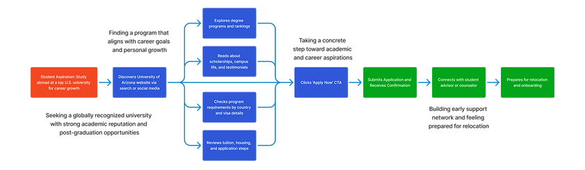
The revised flows introduce a clear, guided sequence that leads students seamlessly from exploring degrees to starting their application—enhancing clarity, engagement, and overall conversion.


Hi-fi wireframes and prototyping
Lo-fi wireframes translate low-fidelity sketches into detailed, high-visual-fidelity designs that closely resemble the final product, incorporating precise typography, color schemes, imagery, and realistic content to convey the look and feel accurately. Prototyping allows stakeholders to test user flows, gather feedback, and refine the design before development begins.


Conclusion
The redesign successfully transformed a fragmented and confusing user experience into a streamlined platform that better supports prospective international students in navigating programs, applications, and key information. By establishing a clear guided journey and a unique sub-brand aesthetic, the project enhanced usability, engagement, and trust, culminating in refined designs handed over for development and further validated through post-launch testing.
Key Learnings
-
Thorough qualitative research, including student interviews and persona development, is essential for uncovering culturally specific pain points and prioritizing features that truly address international users' needs, such as program requirements by country and cost transparency.
-
Creating a consistent design system with authentic imagery, intuitive navigation, and focused guidance on outcomes (e.g., rankings and employability) significantly reduces friction, builds emotional connection, and differentiates the site in a competitive higher education landscape.